1r:1
My dear Theo,
I received your letter with the enclosed today. Your letter gave me a great deal of pleasure because I think I discern in it a few things that I’d like to go into in more detail. Coming straight to the point: what you write about a certain study of a basket of apples
1 — is well observed — but — did you come up with that on your own??? Because I fancy, indeed I’d say
know for sure, that you used
not to see that sort of thing. Be this as it may — here we are on the way to agreeing more about colours. Now pursue
those questions — because that will get you further, and
Bürger and
Mantz and
Silvestre knew that.
Just to say
how that study was painted — quite simply this. Green and red are complementary. Well there’s a particular — red in the apples, very coarse in itself — and greenish things as well. Now there are one or two apples in a different colour too — which make the whole thing right — in a particular pink. That pink — is the broken colour, created by mixing the aforementioned red and the aforementioned greenish. There you have the reason why there’s an association between the colours. Added to this is a second contrast — the background forms a contrast to the foreground.
1v:2 The one is a neutral colour, obtained by breaking blue with orange, the other the same neutral colour, only altered by the addition of some yellow.
But — this gives me immense pleasure, that either by direct or by indirect personal feeling you notice a colour combination. Further — that one of the studies appeared to you to be a variation on the brown-grey theme — that’s very definitely the case — only — all
3 of them are, the ones of the potatoes, with the difference that one is a study in sienna,
2 the other in burnt sienna,
3 the other in —
yellow ochre and red ochre.
4The latter — that’s the large one —
to my mind — is the best — despite the matt black background, which I left matt on purpose because the ochres are also naturally
non-transparent colours. As regards this study — the largest one of the potatoes — it was made by altering those non-transparent ochres, by breaking them with a transparent blue.
1v:3 Red ochre and yellow ochre forming an orange, their combination with blue is more neutral, and they become either redder or yellower against that neutralized colour. The highest light on that whole canvas is quite simply some pure yellow ochre. And the fact that this matt yellow still stands out is because it’s in a wide field of a sort, albeit neutral, of violet; after all — red ochre with a blue gives violet tones.
Well — the nests were also painted on a black background on purpose
5 — for the reason that I simply want it to be obvious in these studies that the objects appear against a conventional background, and are not in their natural setting. A —
living nest in nature is — something very different; one hardly sees the nest itself, one sees the birds.
Given that one wants to paint nests
from one’s collection of nests, one can’t say emphatically enough that the background and setting in nature are very different — so I made the background — simply black.
1r:4 That, though, a coloured background is attractive in a still life is — certain. In Amsterdam I saw still lifes by
Miss Vos that I thought
outstanding —
a good deal better than
Blaise Desgoffe — really
Van Beijerenesque.
6 It also occurred to me that those simple still lifes of hers had a good deal more artistic value than many a pretentious canvas by other Amsterdam artists.
They struck me as very good. Particularly one with a gold vase, a few empty oyster shells, a broken coconut shell and a crust of bread.
I’ll send you the book by
Blanc7 — want to read L’art du XVIIIme siècle as soon as possible — I particularly want to hear something about
Chardin by
De Goncourt.
8 La Caze’s
Rembrandt is really also in that sentiment of Rembrandt’s late years.
9 It must be 12 years ago that I saw it, but I still remember it because it struck me, just like that head by
Fabritius in Rotterdam.
10 If I remember rightly, that nude woman in the La Caze Collection is also very fine, also from the later period.
11 The fragment of Rembrandt’s anatomy lesson, yes, I was astounded by it too. Do you remember those flesh colours? It’s — OF THE EARTH, particularly the feet.
12
2r:5 Listen —
Frans Hals’s flesh colours are also earthy, that’s to say in the sense you know. At least often. There’s also sometimes — I almost dare say always — a relationship of contrast between the tone of the clothes and the tone of the face.
Red and green are opposed — the singer (
Dupper),
13 who has carmine tones in the flesh colour, has green tones in his black sleeves,
and ribbons on those sleeves in
a different red from that carmine. The orange, white, blue chap I wrote about has a
relatively neutral complexion, earthy, pink, violetish, by contrast with his
Frans Hals yellow leather suit.
14The
yellow chap — dull lemon — definitely has dull violet in his mug.
15Well — the darker the garb the lighter the face,
sometimes at least (
not by chance) — in his portrait and that of his wife in the garden,
16 there are
two black violets (blue violet and reddish violet), and a solid
black (yellow-black?) — repeat — reddish violet — and blue violet-black and — black — in other words the 3 most sombre things — well then — the faces are —
very fair —
extraordinarily fair, even for
Hals.
Millet,
Rembrandt and, for instance,
Israëls — it has sometimes rightly been said of them that they are — harmonists rather than colourists.
18
But — tell me —
black and
white, may one use them or not? Are they forbidden fruit?
19I think not.
Frans Hals must have had twenty-seven blacks.
White — but you know yourself what singular paintings some modern colourists purposely made with white on white. What does that phrase mean,
one may not?
2v:6 Delacroix — called them
rests, used them as such.
20 You mustn’t be prejudiced against them, because provided they’re in their place and in balance with the rest, one may use
all tones — that goes without saying. Do you know that I often think the things by
Apol, say, in white on white, are very good.
His Sunset in the Haagse Bos, for instance, which is in Amsterdam. That thing is actually deuced fine.
21No — black and white, they have their reason and significance, and anyone who suppresses them won’t get it right. The most logical, certainly, is to regard them both as — neutral.
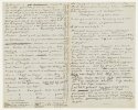
The white the very highest combination of the lightest possible red, blue, yellow — black the very lowest combination of the darkest red, blue and yellow — I have nothing to say against that statement, I think it absolutely true. Well — the light and shade — the tone in terms of value — is directly related to that 4th spectrum from white to black. After all, where one has:
| Spectrum |
1 |
|
from |
yellow |
|
to |
violet |
| ,, |
2 |
|
,, |
red |
|
,, |
green |
| ,, |
3 |
|
,, |
blue |
|
,, |
orange |
| ––––––– |
|
––––––––––––––––––––––––––––– |
Sum a fourth spectrum
that of the neutral
tones, that of red + blue + yellow
|
,, |
white
red + blue + yellow.
the most extreme light |
|
to |
black
red + blue + yellow.
the most extreme black |
That’s how I, for my part, understand the blacks and whites.
If I mix red and green to a reddish green or greenish red,
| by adding white I then get |
| |
Pinkish green or greenish pink. |
|
And, if you will, by adding black, |
| |
brownish green or greenish brown. |
Isn’t this clear?
If I mix yellow with violet to a lilac yellow or yellow lilac, in other words to a neutralized yellow or a neutralized lilac, by adding white and black I get greys.
So. There is primarily a question of greys and browns when one makes colours lighter or darker, whatever their nature and their red, yellow or blue content may be.
To my mind, speaking of light and of dark greys and browns is expressing it correctly.
But how fine what
Silvestre says about
Delacroix is — that he took an accidental tone on his palette,
the unspeakable shade,
purplish, that he put that tone down somewhere,
either for the highest light
or for the deepest shadow, but made something of that
mud that either glittered like light or was as sombrely silent as deep shadow.
22For instance I’ve heard of an experiment with a sheet of neutral coloured paper — which became greenish on a red background, reddish on a green one, bluish on orange, orangish on blue, yellowish on violet, and violetish on yellow.
2r:8 Listen — suppose one wants to make a
muddy tone or
snot colour like this look
light in the painting, what
Delacroix said — that
Veronese could paint a blonde, nude woman with a colour like mud so that she
looked white and blonde in the painting.
23 Question — how is such a thing possible except by opposing great forces in blue-blacks or violets or reddish browns?
You — who look to see whether you can find dark shadows somewhere and think that if the shadows are dark, indeed black, then it’s no good, are you right? I think not. For — then
Delacroix’s Dante,
24 say, the Zandvoort fisherman,
25 say, are no good, for they really do have the strongest forces of blue or violet blacks in them.
Rembrandt and
Hals, didn’t they use black? And
Velázquez??? Not just one, but twenty-seven blacks, I assure you.
26 So that — ‘not allowed to use black’, come on, do you actually know yourself what you mean by it? And what you want to achieve by it? Really think about it, because you could well come to the conclusion — I regard this as highly likely, that you have learnt and understood the question of —
tones — wrongly, or rather have learnt them
vaguely and understood them
vaguely. There are so many people like this; most people are like this. But you’ll discover it eventually through
Delacroix and others of that period. Tell me — have you thought that those studies of mine that have black backgrounds have been pitched
very low IN THEIR LIGHTS??? And so where I pitch my study
lower than in nature I still maintain the relationship between the tones, since I become darker not only in my shadows but also proportionally IN MY LIGHTS TOO? I made my studies specifically as gymnastics, to fall and to rise in tone — so — don’t forget this, that I painted my white and grey moss literally with a mud colour, and that it nonetheless looks light in the study.
27 Adieu, regards.
Yours truly,
Vincent
These things that relate to complementary colours, to simultaneous contrast
28 and to the way complementaries neutralize each other, this question is the first and foremost. The
other is — the effect on each other of two
similar colours, for example a carmine on a vermilion, a pink lilac on a blue lilac.
The third question is a light blue against the same dark blue, a pink against a brown red, a lemon yellow against fawn yellow, &c. But the first question is the most important.
And if you find some book or other on colour questions that is good, do be sure to send it to me, for I too know far from everything about it, and go on searching every day.


![[2529]](/vg/interface/artworkref.png "Vincent van Gogh - Basket of apples (F 99 / JH 930) (Click to view image)")
![[2529]](/vg/illustrations/2529t.jpg "Vincent van Gogh - Basket of apples (F 99 / JH 930)")
![[2530]](/vg/illustrations/2530t.jpg "Vincent van Gogh - Basket of potatoes (F 100 / JH 931)")
![[2532]](/vg/illustrations/2532t.jpg "Vincent van Gogh - Basket of potatoes (F 116 / JH 934)")
![[2531]](/vg/illustrations/2531t.jpg "Vincent van Gogh - Baskets of potatoes (F 107 / JH 933)")
![[2533]](/vg/illustrations/2533t.jpg "Vincent van Gogh - Still life with birds’ nests (F 111 / JH 939)")
![[1410]](/vg/illustrations/1410t.jpg "Maria Vos - Still life with goblet")
![[2159]](/vg/illustrations/2159t.jpg "Rembrandt van Rijn - Portrait of a man")
![[1885]](/vg/illustrations/1885t.jpg "Carel Fabritius - Self-portrait")
![[2160]](/vg/illustrations/2160t.jpg "Rembrandt van Rijn - Bathsheba bathing")
![[2161]](/vg/illustrations/2161t.jpg "Rembrandt van Rijn - Susanna bathing")
![[337]](/vg/illustrations/337t.jpg "Rembrandt van Rijn - The anatomy lesson of Dr Joan Deyman")
![[2154]](/vg/illustrations/2154t.jpg "Frans Hals - The fool")
![[152]](/vg/illustrations/152t.jpg "Pieter Codde and Frans Hals - The company of Captain Reynier Reael and Lieutenant Cornelis Michielsz. Blaeuw (‘The meagre company’)")
![[150]](/vg/illustrations/150t.jpg "Frans Hals - The merry drinker")
![[153]](/vg/illustrations/153t.jpg "Frans Hals - Isaac Abrahamsz Massa and Beatrix van der Laen")
![[2158]](/vg/illustrations/2158t.jpg "Ferdinand Victor Eugène Delacroix - The barque of Dante (Dante and Virgil in hell)")
![[510]](/vg/illustrations/510t.jpg "Lodewijk (Louis) Franciscus Hendrik Apol - Sunset in the Haagse Bos")
![[3063]](/vg/illustrations/3063t.jpg "Jozef Israëls - The Zandvoort fisherman (At the churchyard)")